
Monumental Sports & Entertainment
INFORMATION DESIGN SYSTEM FOR A PUBLISHED BOOK ON MUSIC AND DATA
CLIENT:
Monumental Sports & Entertainment
ROLE:
Design and art direction, environmental graphics, campaign systems
SCOPE:
Five brands · [XX] deliverables a season · embedded 20 hrs/week
YEAR:
2024-2026
Monumental Sports & Entertainment operates eight professional teams and five venues in Washington, D.C. I've worked across five of its brands as a contractor: the Washington Capitals for three seasons, the Capital City Go-Go for two, the Washington Mystics for one, and event and concert promotion for Capital One Arena and EagleBank Arena across two years.
Each brand has its own brand rules, style guide, tone and audience.
A single week often touches several of them, against game and event deadlines that do not move.
The work happens inside design systems that already exist. Sometimes I originate a campaign, sometimes I adapt existing artwork into new formats, and either way it has to stay true to the brand it belongs to.
TEAMS SUPPORTED


THE APPROACH
Start with every format & team in mind.
Make the Memory promoted the final game of the Mystics' record-breaking 2026 regular season, played at Capital One Arena rather than the team's usual home. The Capitals Holiday Pack is an exclusive ticket and gift bundle offered annually.
Both needed art that stands apart from the season's standard look, so the campaign reads as an event rather than routine messaging. And both still had to read unmistakably as the team, inside its brand rules, at every size they ran. That range goes from a phone screen to the digital billboard in Chinatown.
Those considerations start with the first design. While I'm drafting it I'm weighing whether the type will hold at every size it has to run, and whether there's something here the video team can animate. On the Holiday Pack they animated the string lights to blink, which worked because the lights were built as their own element rather than baked into the artwork.
Built this way, the campaign holds together across every placement, and the teams downstream get something to build on rather than something to work around.
The space sets the spec.
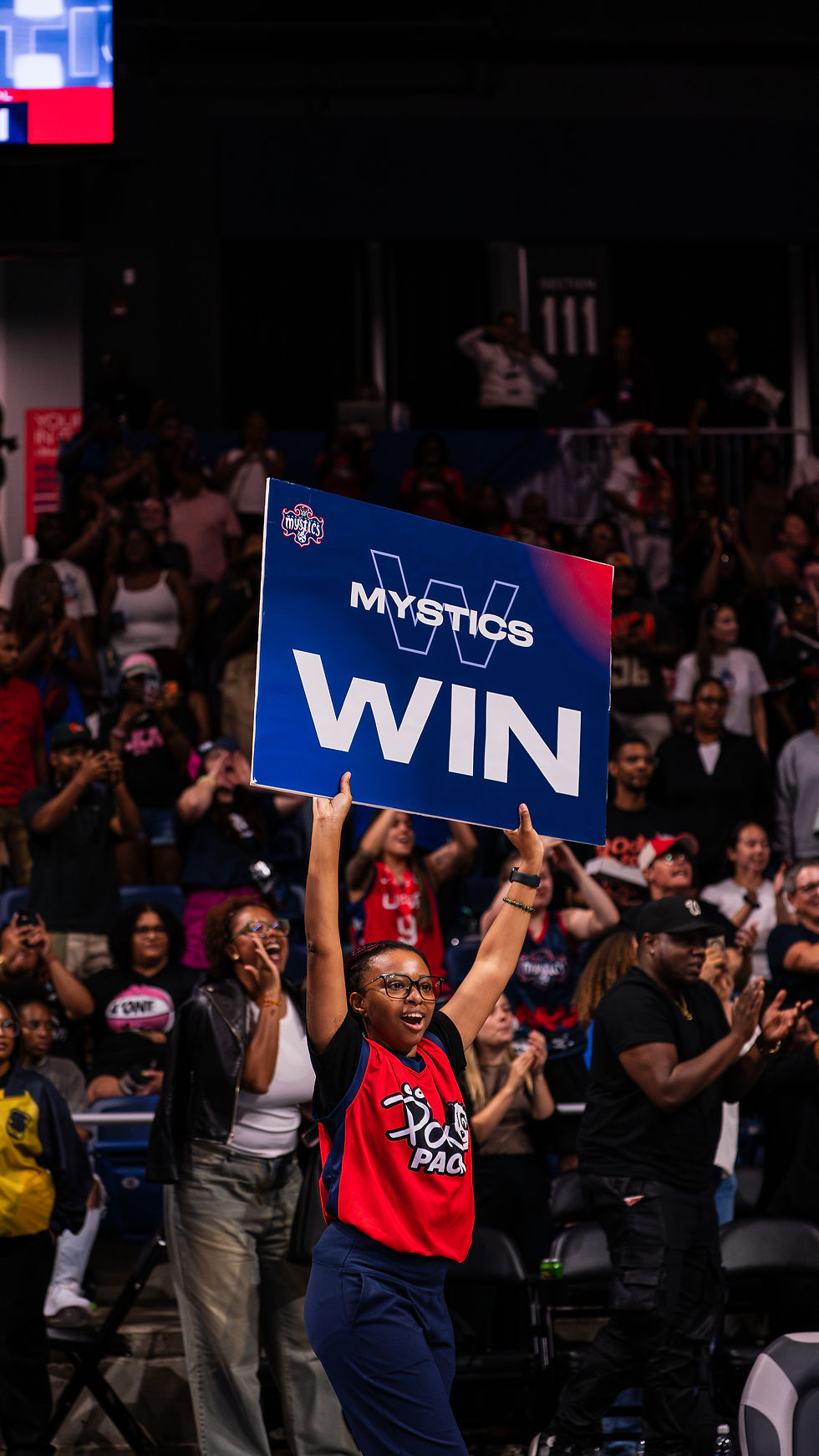
The environmental work ranges from signs the dance teams hold up in the bowl to digital screens and physical installations.
These need to read from a distance, in motion, usually by someone whose attention is elsewhere. Large format printing has to meet production requirements. Digital signage has to account for resolution, arena lighting and safe areas for broadcast bugs. And everything has to handle sponsor logos correctly, at the presence and placement that was agreed.
The work goes up in front of 20,000 people, with no soft launch and no quiet fix. That highlights the importance of knowing the style guides well and turning in clean files the first time.
Extend existing work without diluting it.
The Mystics end-of-season awards came to me already designed. Phoebe Bridgers came as the artist's own admat, made for a tour rather than for this building.
Neither was mine to reinvent. I took the awards campaign into a website and social carousels, and brought the tour art into Capital One Arena's screen specs and brand rules.
The standard is consistency. An artist's work and a campaign's look both have to keep their integrity wherever they land, so that a fan gets the same message and the same look whether they meet it on a social post, in an email or on a screen in the concourse.




GALLERY


THE OUTCOME
What began as a three-month contract with the Washington Capitals has run three years across five Monumental brands. I've become a resource they return to for developing campaigns and keeping production moving: on brand, on spec and on time, across whichever brands need something that week.