
91 of US
SELF-INITIATED PUBLIC EDUCATION CAMPAIGN: IDENTITY, INFORMATION DESIGN, AND AN INSTALLATION ON THE NATIONAL MALL
CLIENT:
Self-initiated
ROLE:
Creator, creative direction, design
SCOPE:
Identity, information design, environmental installation, community partnerships
YEAR:
2016 - Present
91 of US is a public education campaign I created and designed in 2016. Based on CDC data available then, an average of 91 Americans were dying every day from gun violence, which can be broken into suicide, homicide, and unintentional shootings.
Numbers that large are hard to wrap your head around, and the subject has become partisan enough that most people arrive already on the defense. I wanted to build a space for a fact-based, bipartisan conversation: somewhere a viewer could see the daily toll at scale, learn some of the context behind that number, and then be connected, on the spot, with something to do about it. The identity is set as a fraction, 91 over US, which does two jobs. It marks the problem as a uniquely American one, and it establishes a campaign driven by numbers rather than politics.
FEATURED IN:


THE APPROACH
Make the number real.
The display is 91 empty chairs, one for each American lost in a day. Each chair wears a t-shirt in one of three colors: red for suicide, blue for homicide, yellow for unintentional shootings.
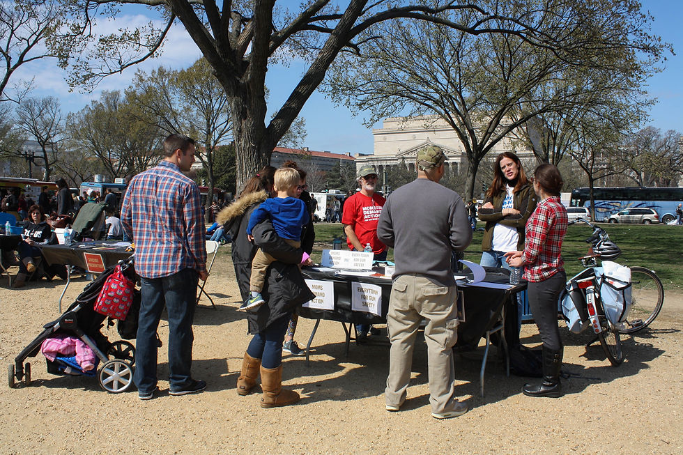
The chairs are distributed in the real proportions of the three categories, so a viewer takes in the breakdown before reading a single statistic, including the fact that most of the 91 are suicides. Each chair commemorates someone who should still be here. Feeling that first is what opens a viewer up to the information that follows. These photos are from the original event on the National Mall in Washington, D.C.


Use a visual language Americans already know.
The posters carry the statistical detail, color coded to the shirts so a viewer can connect a color they just saw on a chair to the data behind it.
I pulled the palette and the layouts from WW2-era American poster design. It gives the campaign a distinctly American look for a distinctly American problem.


Don't end on the statistic.
A campaign that stops at awareness leaves a person holding a number and nothing else.
Community organizations are present at every event, placed after the chairs and the posters. They represent issues like firearm legislation and background checks, safe storage and handling, suicide prevention and mental health care, domestic violence intervention and survivor support, and community violence intervention. The order is the design: the chairs land emotionally, the posters explain what drives the figure, and the organizations give someone a way to act on it before the feeling wears off.


THE OUTCOME
91 of US first ran on the National Mall in Washington, D.C., and has now been covered by the Wall Street Journal and News 4 New York, and shown at Conner Smith Gallery. It also found a use I didn't design it for. I work with Hackensack Meridian Health's Jersey Shore University Medical Center to run the campaign as ongoing staff education, since healthcare workers are positioned to recognize domestic violence or suicidal ideation and offer resources before a tragedy. It has been presented at the American College of Surgeons' Trauma Quality Improvement Program conference and the Trauma Center Association of America conference.